Concept Creating
Design Research
Prototyping
Video Editing
Wireframing
Figma
Adobe Dimension
Adobe Photoshop
Adobe Illustrator
Premiere Pro
MusicNet
MusicNet
MusicNet
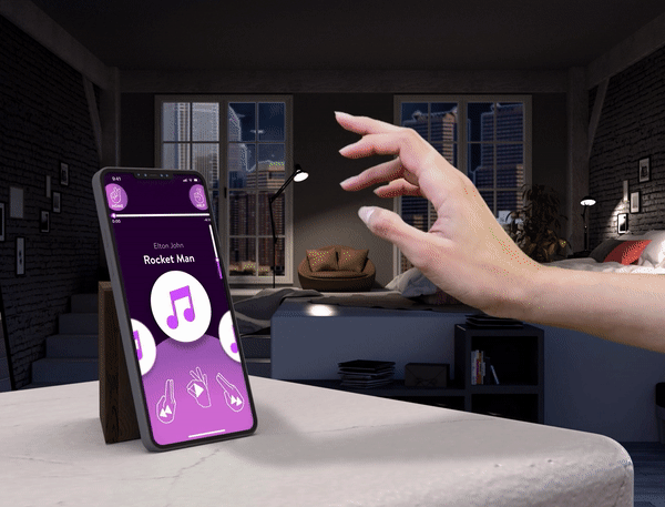
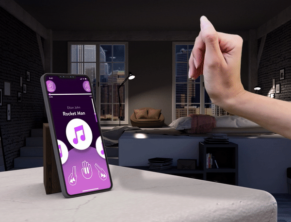
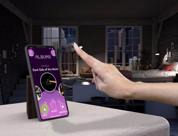
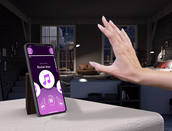
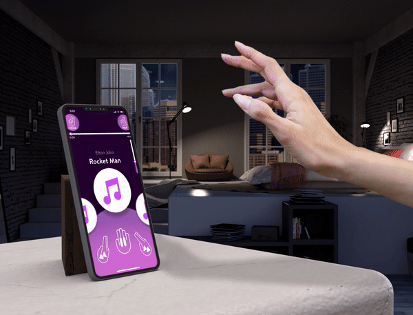
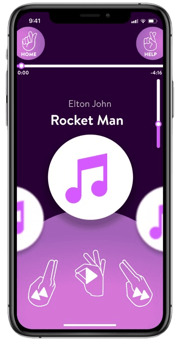
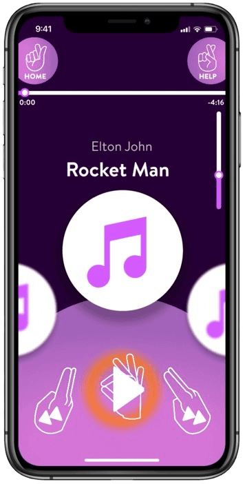
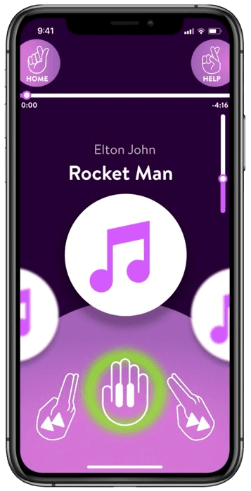
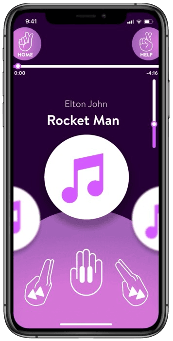
A music app controlled with hand gestures.
A music app controlled with hand gestures.
A music app controlled with hand gestures.
Timeline
Sep - Nov 2021
Course
Natural User Interfaces & Objects
Professor
Graham Plumb
Timeline
Sep - Nov 2021
Course
Natural User Interfaces & Objects
Professor
Graham Plumb
Timeline
Sep - Nov 2021
Course
Natural User Interfaces & Objects
Professor
Graham Plumb
Project Brief
Today almost everything is being done through a smartphone, like ordering food at a restaurant or checking into a flight.
With our current smartphone technology, we realize that our visionary senses are limited to a couple of tools: our fingers, and our phone. We take for granted what we can feel and manipulate with our hands every day, a human experience that a glass screen cannot live up to.
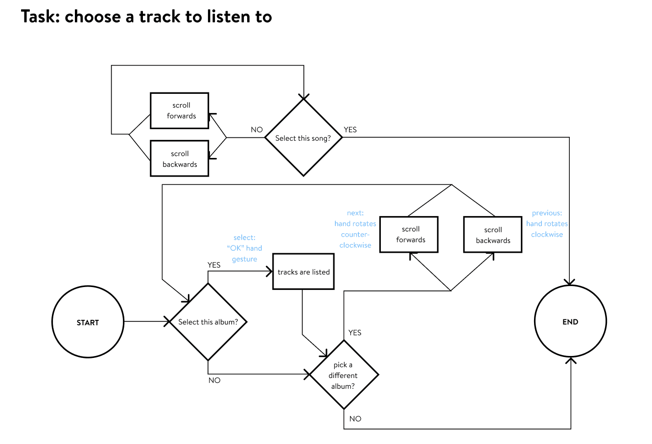
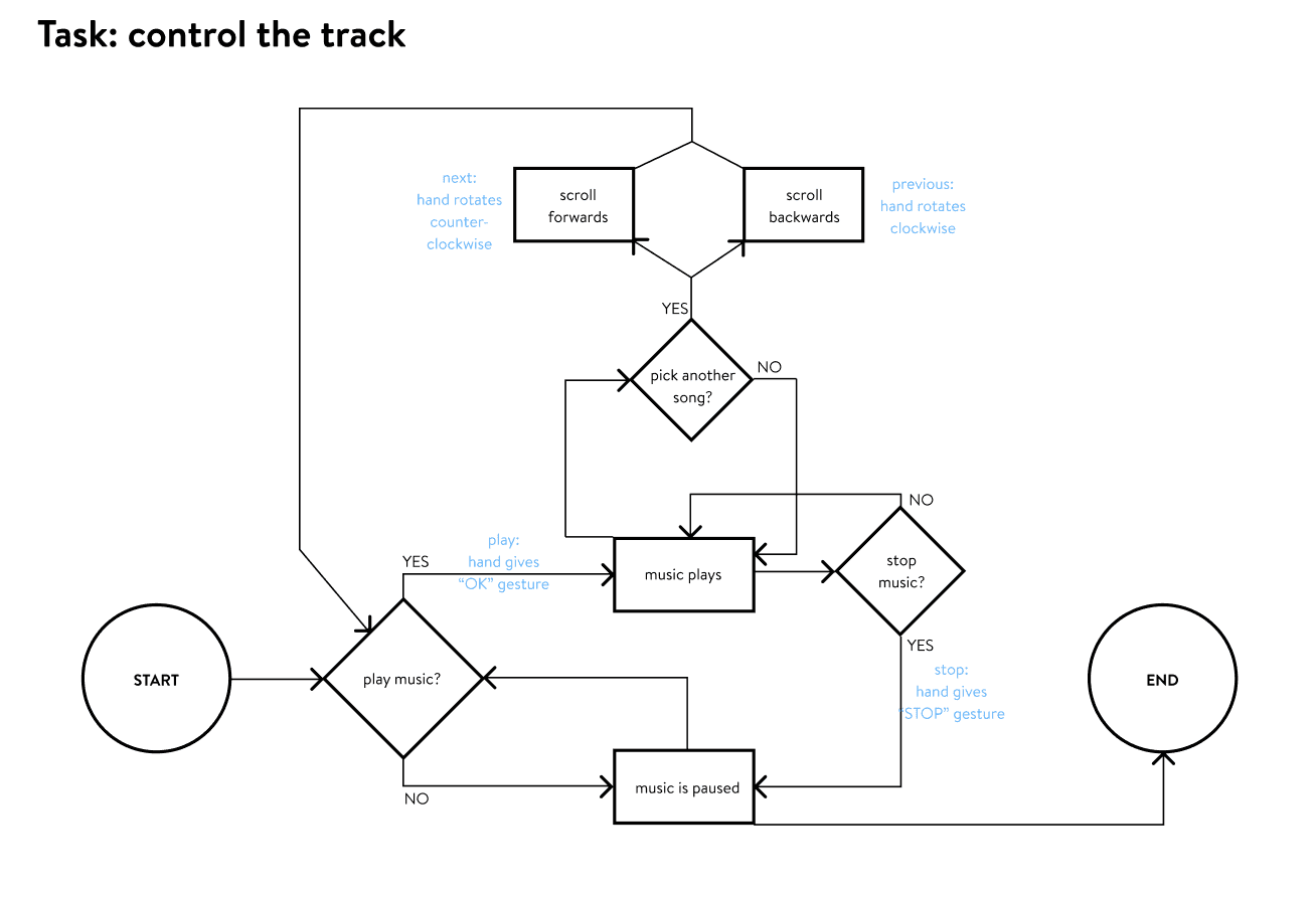
How might we help music lovers play their music through a natural user interface in diverse environments?
How might we help music lovers play their music through a natural user interface in diverse environments?
Solution
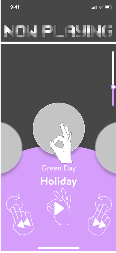
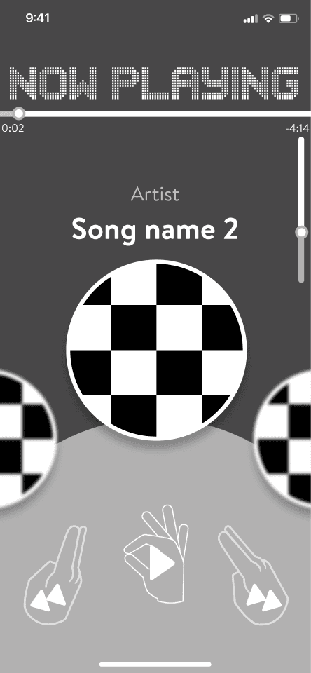
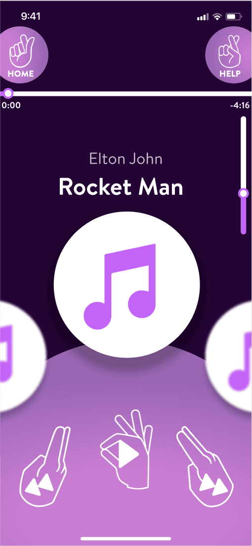
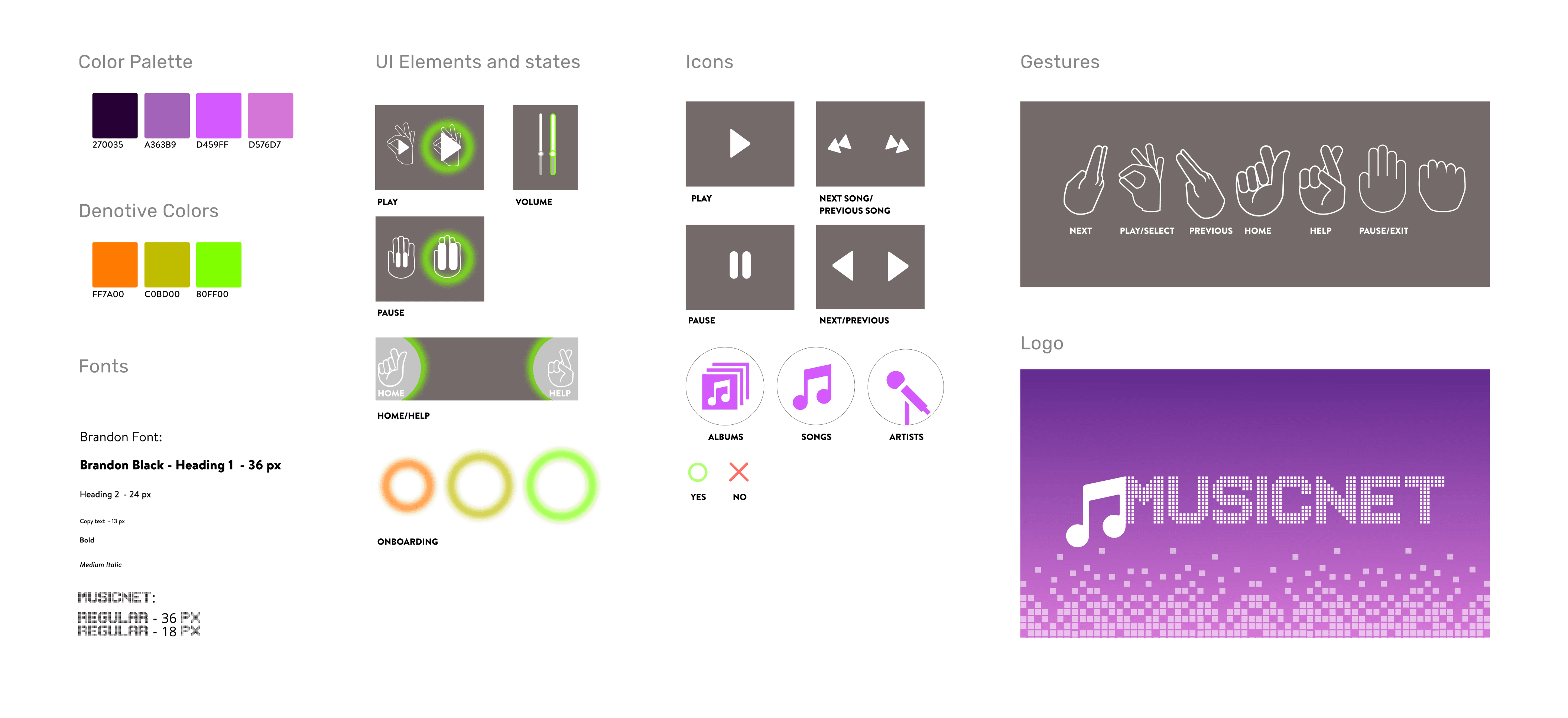
A music app that expands your tactical abilities, expanding your intuition outside of a small screen.
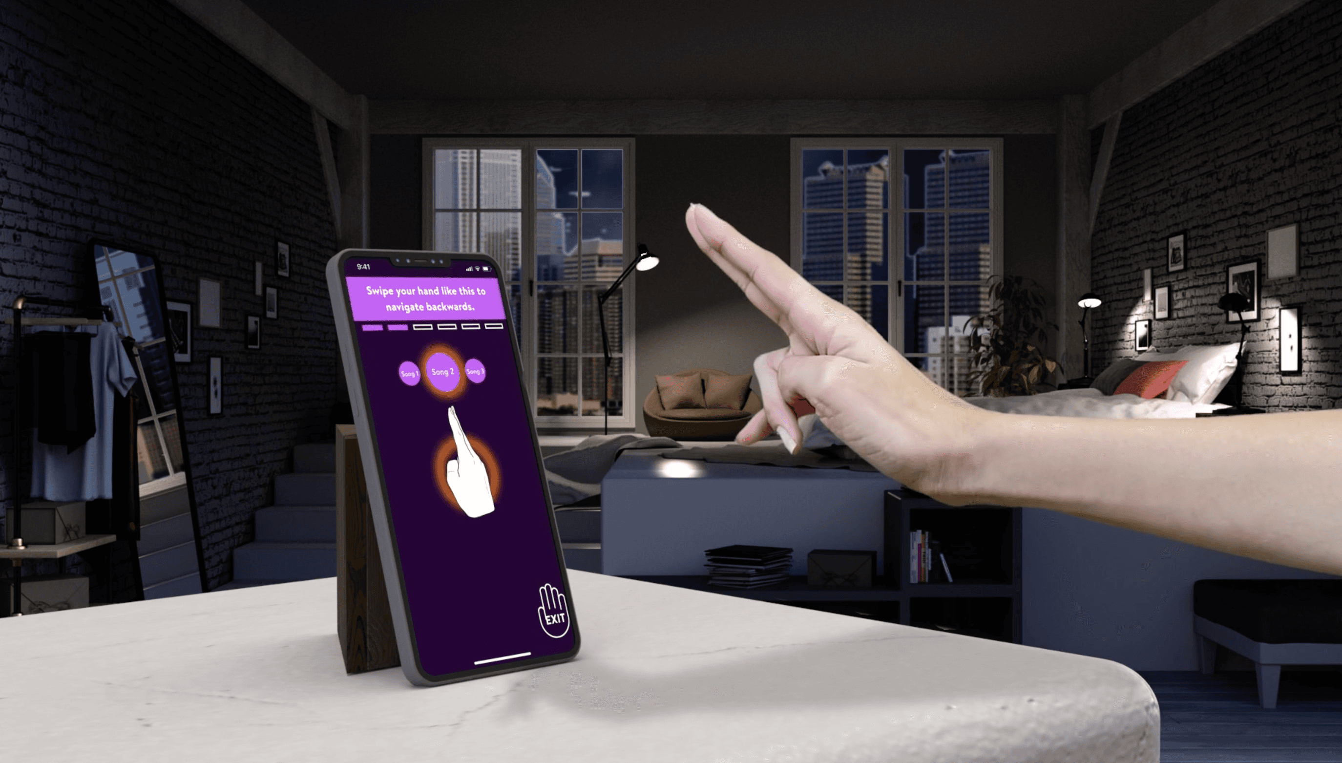
With MusicNet, one can play music "on-air", without any contact, without ignoring surroundings, and without limiting one's senses to just a couple of fingers.
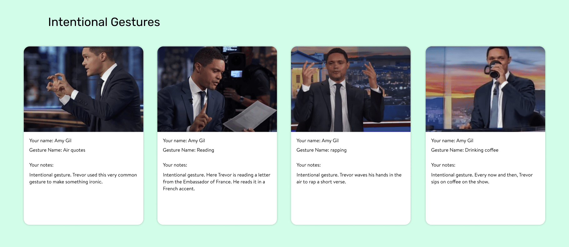
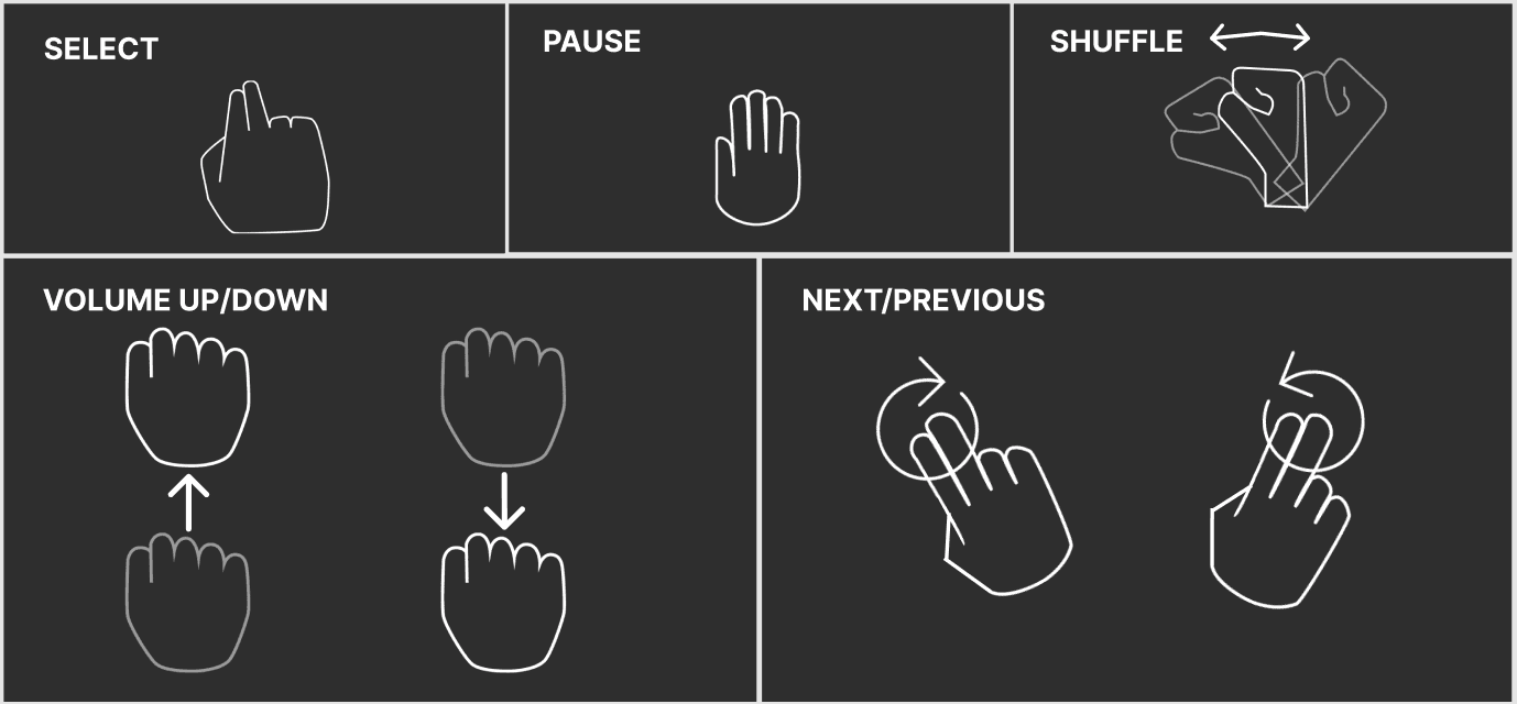
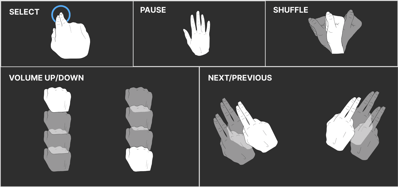
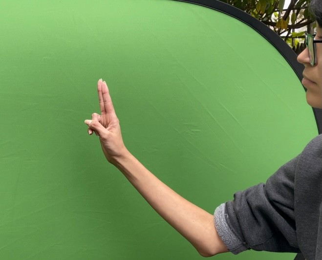
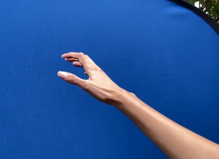
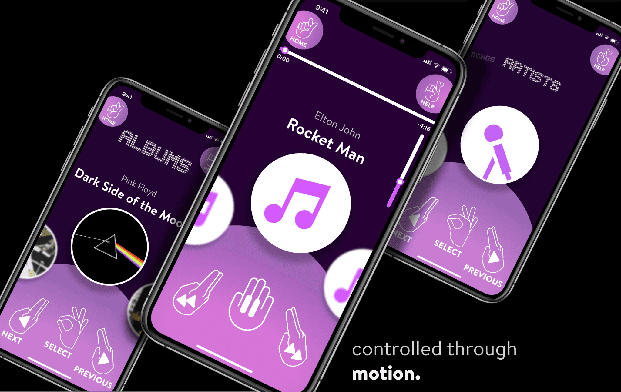
Play, pause, skip, shuffle, and browse your music effortlessly with a few hand gestures.
Since Natural User Interfaces (NUIs) are becoming more apparent in our society, this human experience can help us be more aware of our surroundings.
A music app that expands your tactical abilities, expanding your intuition outside of a small screen.
With MusicNet, one can play music "on-air", without any contact, without ignoring surroundings, and without limiting one's senses to just a couple of fingers.
Play, pause, skip, shuffle, and browse your music effortlessly with a few hand gestures.
Since Natural User Interfaces (NUIs) are becoming more apparent in our society, this human experience can help us be more aware of our surroundings.